


Fluid Design With Viewport Units
"A fluid site is responsive, but not all responsive sites are fluid."
Sam McKinney
Before we start telling the story of "fluid design," we should do a short refresher on what we know about another concept – fixed property values.
Most property values on older websites are predetermined, making them fixed or static, which means that the display won't respond to different screen sizes. For example, if a website is set to display at a fixed width, let's say 1080px, the display can't adjust to smaller or larger screen width. And since the number of different screen resolutions has skyrocketed in the past years, this became a problem.
Difference between Responsive and Fluid Website Design?
There is more than one solution to this. Website design trends have differentiated "responsive" and "fluid." For the time being, responsive is much more popular, but fluid is making its way to the top.
Responsive design uses breakpoints and set containers to adjust to different screen sizes. Those predetermined categories serve as a response to screen sizes ranging from small (e.g., mobile) to large (e.g., desktop). To achieve this, we use media queriess, which controls the design and content as it changes from device to device.
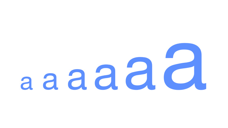
Fluid Design, on the other hand, changes the game by introducing a new unit – viewport unit. The viewport is what you see on a given screen, the visible area of a website at a give point in time. For example, 1 viewport width equals 1% of the viewport's width. This makes Fluid Design more dynamic, as it adjusts to any bit of change in the display of the device we are projecting to.
Further on Viewport Units
First of all when we describe the viewport we are talking about the visible area of the website on our screen. This makes viewport units incredibly useful for sizing elements on your page relative to the size of the viewport. The units differ from percentages because they are always relative to the viewport, whereas a percentage is relative to the element’s parent container.
Four new “viewport-relative” units appeared in the CSS specifications between 2011 and 2015, as part of the W3C’s CSS Values and Units Module Level 3 and they are vw, vh, vmin and vmax.
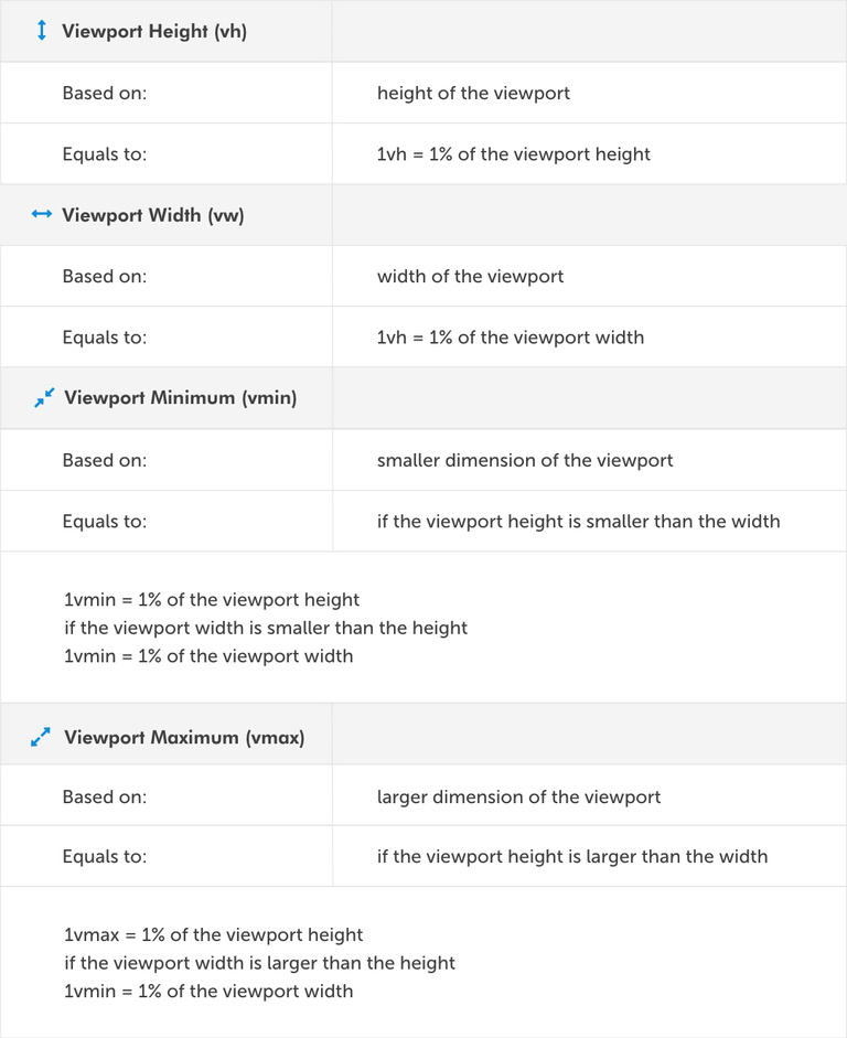
At this point, viewport units may sound similar to percentages. However, they’re very different. In the case of percentages, the width or height of the child element is depend of its parent element while the viewport units depends on user’s screen.
Getting Started with Fluid Web Design
For the time being, let's say that we are working on our 1000 x 800px sized window.
Trying to set our font-size to a fluid unit, we'd tell our editor that:
html {
  font-size: 1.5vw;
}
This means that our font-size is 15px and will change to about 20px if we get our window to a size of 1333px. In the example above, we've set the root element to 1.5vw. Which means we have changed the "room em." As we know, em and rem units will now also be fluid because they are related to the root em.
For example,
h2 {
  font-size: 2rem;
}
This h2 is now equivalent to 3vw because 2rem means twice the size of the root em, being 1.5vw.
Less wordy:
1.5vw on a 1000px viewport width = 15px
2rem = 2 * 1.5vw = 3vw = 30px
And then, if you resize your browser to 1440px width h2’s font-size will be 43.2px:
1.5vw on a 1440px viewport width = 21.6px
2rem = 2 * 1.5vw = 3vw = 43.2px
As this could be a bit confusing, we crafted an app that will convert your pixels to viewport units: https://viewport-units-converter.kodius.com. Fluid design is incorporated into this app so you can witness the magic on the spot.
By now, things might seem perfect, but we do have a problem on our hands. We don't have precise control over the rate of scale, meaning we don't have min or max font-sizes or some other things that we might want to avoid.
Luckily, there are ways to overcome all of these limitations.
Controlling Viewport Units To Achieve a Best Possible Result
Viewport units could be seen as a blunt instrument and sometimes require additional effort to get optimal results.
Without controlling the units, we could end up with ridiculously small font sizes on a small viewport. As we yet do not have a min-font-size property in CSS, mustering the solution requires a bit of thinking. We will take media queries from responsive design and combine them with viewport units and pixels.
So let’s say for example that we want font-size on root element:
- to be 16px on 320px screen and smaller
- to go between 16px on a 320px screen to 25px on a 1000px screen
- and to be 25px on 1000px screen and larger
Here is a working implementation for that case:
html {
  font-size: 16px
}

@media screen and (min-width: 320px) {
  html {
    font-size: calc(16px + 9 * ((100vw - 320px) / 680));
  }
}

@media screen and (min-width: 1000px) {
  html {
    font-size: 25px;
  }
}
The solution comes from Mike Riethmuller. Background math goes like this:
font-size: calc([minimum size] + ([maximum size] - [minimum size]) * ((100vw - [minimum viewport width]) / ([maximum viewport width] - [minimum viewport width])));
Further on, our Viewport Units Converter also has a part which converts the input data into working code.
https://viewport-units-converter.kodius.com/advanced-options
Conclusion
Now you know what Fluid Design is, how to use Viewport Units, and on top of that, how to bypass some limitations. We hope that you found this useful. :D
Thanks for reading, and enjoy the magic of the fluid design.
For further reading
• piccalil.li
• moderncss.dev
• madebymike.com.au
• smashingmagazine.com
• www.w3.org


