


business
Offshore software development
Often seen and advertised, it consists of offshoring the software development process to a country with lower production costs so as to decrease your business' expenses.

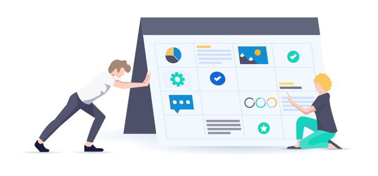
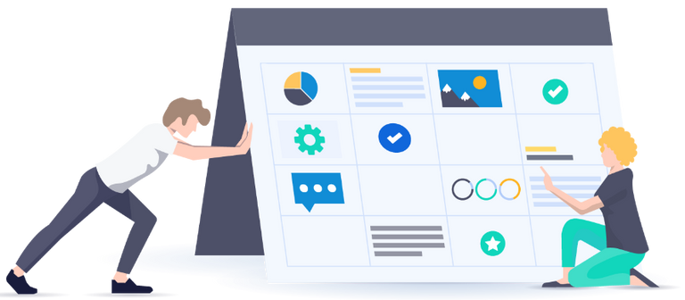
Build tailor made solutions for your business

Design modern and usable products

Experienced team and top technologies

Keep focused on features, not maintenance

Architecture - hardware - monitoring

Answer a few questions for customized recommendation

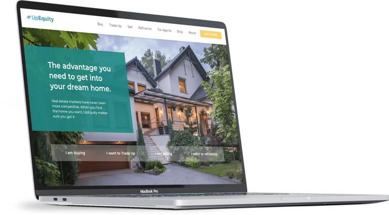


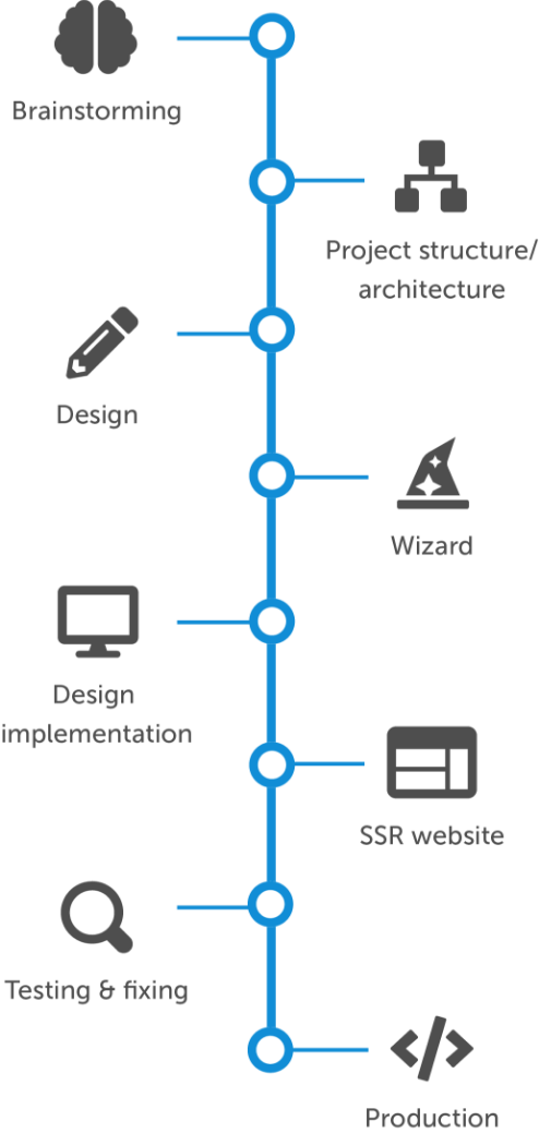


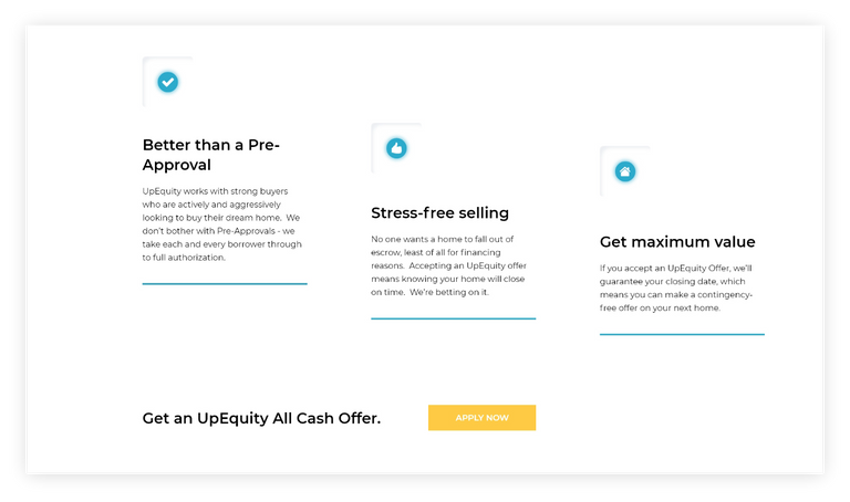
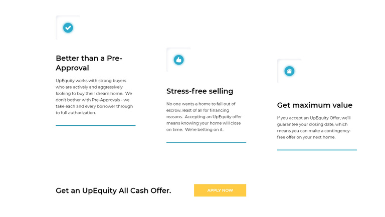
Slide to see the website before and after redesign


Schedule a call
Start the application
This company has been building a better way to buy a home and getting people into their dream homes since 2019.
UpEquity has been building a better way to buy a home and getting people into their dream homes since 2019.


All rights reserved Kodius ©2022


All rights reserved Kodius ©2022