Case study

UI/UX study

Main image for Porezni Papak project - case study

Porezni Papak

PP is an assisting application, bringing the best service to tax administration workers enabling a more intuitive and easier conversion process.

#UI Design

#UX Design

#Product design

Main image for Porezni Papak project - case study

SUMMARY

Loading an .xml file enables a button that initiates the start of the conversion process
and automatically downloads the processed file to the user’s computer.

SUMMARY

Loading an .xml file enables a button
that initiates the start of the conversion
process and automatically downloads
the processed file to the user’s
computer.

About
Type: Personal project
Duration: Four weeks
UX/UI Tools: Adobe XD
Defining the problem
Data processing is performed personally by the tax administration workers, which results in potential mistakes and slowed down process of final conversion.
Project goals
Automatism, intuitiveness, simplifying and speeding up the process of tax summary.

Introduction

There is no such thing as a successful user interface without a great user experience. You can compare it to ordering a delicious-looking meal but it tasting bitter after the first bite. Sounds frustrating, right? That is exactly what you want to avoid while designing user-facing applications and websites.
In this case, our goal is to achieve simplicity and efficiency in the process of converting tax summary data file. Currently, taxes are being personally adjusted and verified by tax administration workers. With this product, the effort and time required to do the same will be only a fraction of what it usually takes.
The application’s flow is quite simple and straightforward. The user uploads an .xml file via a pleasing to look at and easy to use drag&drop interface. The user then gets offered a view of the uploaded file along with a chance to verify the data and make additional changes if necessary (e.g. change or remove existing one). The end-user then initiates this process by hitting “Process”: dictating when is the file processing actually going to start.
After the user hits “Process” the file will get processed and in no time you’ll have the correct file type downloaded at your desktop! If there are errors, the user will have a chance to correct it in the matter of a click or two. Note that for summarization to work, the file format has to adhere to the standard tax documents specified.

Ideation process

Hand drawn concepts

You may have heard how planning is the most important part of any development process. That is completely true because it helps you determine what and how is going to work and for what purpose. Planning may take a lot of time but it helps eliminate the potential complications in the development process or in application usage. The ability to think ahead of potential failures saves time and money!
In this particular example, planning has been sketched on paper. There is no right or wrong way to do it, just make sure to work things out in the most effective way possible. Paper gives an opportunity to sketch thoughts faster and gives an easy overview of the thought process (it tends to get messy sometimes – creatively messy).
Hand drawn concepts/sketches - example one - imageHand drawn concepts/sketches - example two - image

Creating wireframes

After the planning phase, it is time for digital layout development. This is the first wireframe layout sketch in our design process. We’ve split the drag&drop window and the upload button to avoid any misunderstanding and confusion on the user’s end. The goal is to always keep the user’s actionable choices and information clearly separated while also easy to access.
As seen on the image below, we were exploring the option to have multiple files upload. However, after consulting with future users it was decided to keep one file upload form.
Digital layout development; creating wireframes phase image

Developing interactions

If you really love automatization and want to decrease the amount of clicks, demonstrate the finished actions with graphic animations - such as a checkmark after something has been done or use a multi-stage progress bar (e.g. tracking the delivery). Just avoid leaving them clueless.
A need to refine the interface led us to hiding the tutorial text behind the “I” icon, while the introduction text has been kept visible. A short tutorial is temporarily displayed when you open the application.
Only one upload button is shown and below it is a brief note on how many files can be uploaded and processed within a single session. The outlined rectangle has two functions –Drag & drop files or Click & select from your computer.
As it was concluded earlier, the interface had been missing the “initiate” button which in this case is positioned below the upload form and becomes actionable only after a .xml file has been loaded. With this approach, the user has better control over the process, making it more transparent and clear what’s happening and why.
Digital layout development; developing interactions phase image

Redesign process

Clean and simple

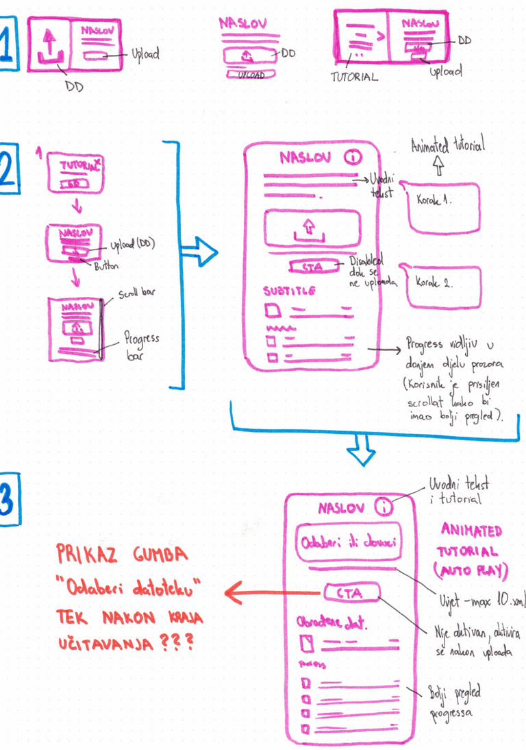
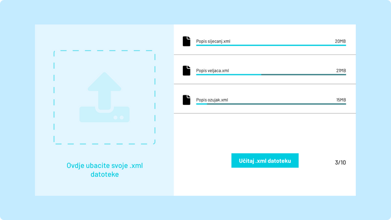
After defining what the application requirements are it was time to start the design from scratch. Getting rid of repetitive elements, coming up with the most effective and organized way to display all the information and interaction, making sure the interface was clean, minimal and intuitive.
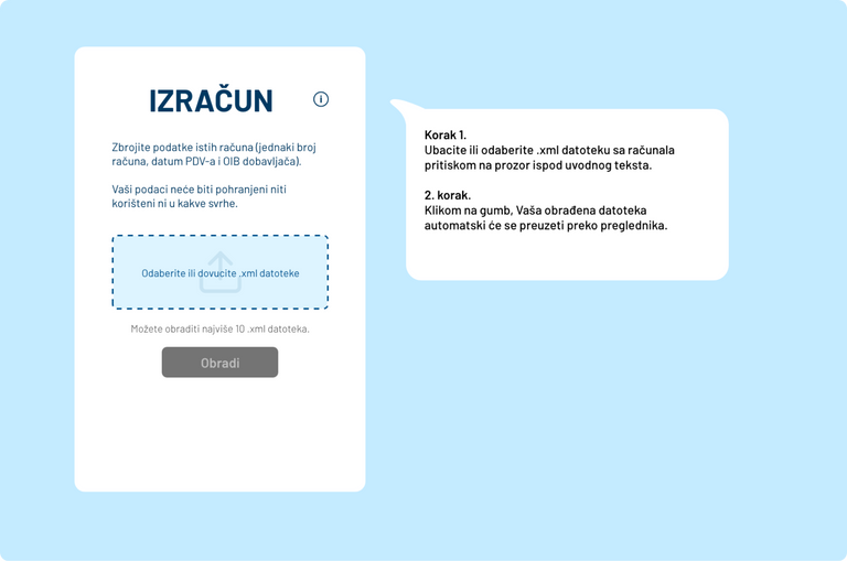
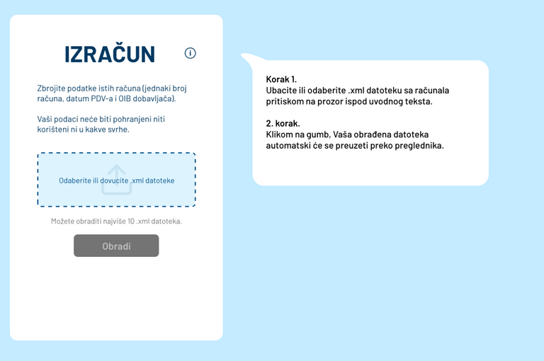
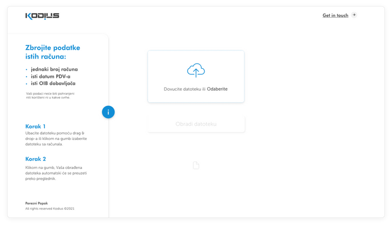
Great interfaces and applications should not require a manual on how to use them. After all, design should be intuitive and a product’s usage must be self-explanatory. Naturally, this doesn’t mean that no “How To Use” information should be displayed — rather, it should be displayed in a more sophisticated manner.
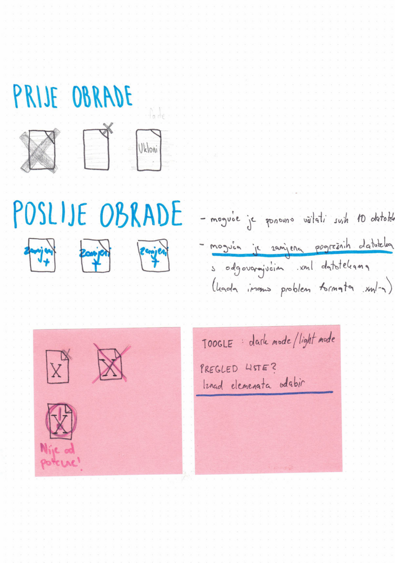
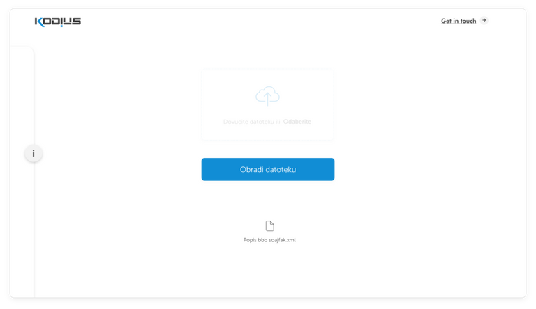
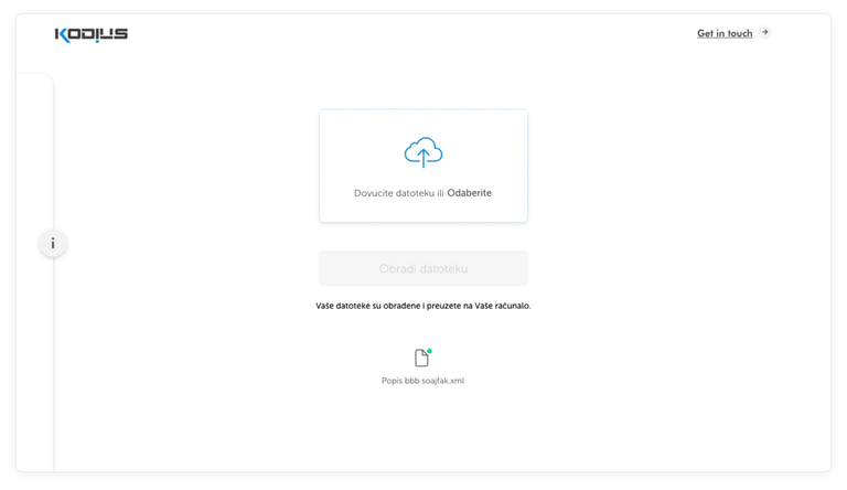
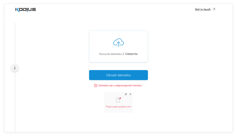
All interactive elements should be understandable since you don’t want to confuse users but instead lead them through the process. If there is no indication of which element is interactive, users tend to lose motivation quickly - they are forced to figure out how the interface works by themselves. That’s a total no! Clicking around the page guessing what leads to what is not what anyone expects. Saving clicks and letting users get what they seek as fast as possible is the right way to develop your concept.
The importance and hierarchy of buttons should be defined and outlined through their sizes, colors and text labels. You want to avoid putting bright green color fill on a button that is not your top click priority. Make sure you establish the right hierarchy so the user’s attention goes where you want them to go.

Creating high fidelity prototype

With all of that in mind, we put a clickable link for browsing your documents right inside of the drag&drop window. It is presented in bold with the text “Odaberite” (eng. Pick/Choose). On hover, the window gets tinted and the icon gets a subtle eye-catching animation. In conclusion, we use a short notice and overlay animation to achieve the “hey I could interact with this!” effect.
File icon gets framed and scaled on hover, revealing a blue plus icon and showing the ability to fill that slot with the .xml file by clicking once.
Creating prototype; select file action/screen image
We hid some additional information about the application on the left side of the screen, where a user needs to click the little “I” info button to open the “information drawer”. While designing the information arrangement, make sure titles, subtitles and paragraphs are defined properly. The text should be clear, concise, distinct enough yet easy to read.
Creating prototype; additional user info drawer image
As already stated, the “Edit” button (the one with the highest priority) becomes active and actionable only after the .xml file is uploaded. In case the user uploads an incorrect file, they get a chance to remove it. After they remove it, they can upload another one, rinse and repeat.
Creating prototype; process file action/screen image
When the process is done, the file icon gets a little green dot in their top right corner.
Creating prototype; processing done info/announcement image
So far you’ve read about how things go when the user is fluent in our interface but we shouldn’t ignore users who aren't well-versed in it! They may not represent the majority but, either way, you don’t want to let them down. So where could things go wrong for them and how can we alleviate their troubles? Or fix them before hand?
The interface handles errors such as incorrect file format and more than one file uploaded. When calculation in the certain file has not run correctly, a user will be able to then replace it with a valid one and it will be automatically handled.
Creating prototype; upload done info/announcement image

Application flow

Conclusion

As an UX/UI designer you should always try to put yourself in your user’s shoes! In the end, they’re the ones who’ll be making use of your product and it is their problems you’re trying to solve. Try to keep things simple, understandable and intuitive. Always look out for little details here and there to try and keep things consistent, easy to read, descriptive and without redundancies that could confuse or distract your users. Your users will thank you for it!
Porezni papak case-study featured blog image
programming
Implementing Google Authenticator in AA
Porezni papak case-study featured blog image
We'll make use of Google Authenticator so you'll have to install the appropriate Ruby gem by adding google-authenticator-rails to your project's Gemfile. Let's get started!